
GPT-5.4 的網頁開發能力比前代模型更出色,能產生更具視覺吸引力、也更大膽的前端。我們在訓練 GPT-5.4 時,特別著重提升 UI 能力與圖像運用。只要引導得當,模型就能打造可投入正式環境的前端,兼具細膩巧思、精心設計的互動與優美圖像。
網頁設計的可能性十分廣泛。優秀的設計能在節制與創新之間取得平衡,既借鑑歷久不衰的設計模式,也帶來新意。GPT-5.4 已學習這些多元的設計方法,理解建立網站的各種方式。
當提示詞不夠明確時,模型往往會回到訓練資料中常見的模式。其中有些是經過驗證的慣例,但許多只是出現頻率過高、我們希望避免的習慣。產出的結果通常看似合理,也能正常運作,卻容易流於制式結構、缺乏清晰的視覺層次,設計選擇也可能不如我們心中的構想。
本指南介紹實用技巧,幫助你引導 GPT-5.4 實現心目中的設計。
模型改進
GPT-5.4 在多個面向都有進步,而在前端開發方面,我們著重於三項實際提升:
- 在整個設計過程中具備更強的圖像理解能力
- 打造功能更完整的應用程式與網站
- 更善於運用工具檢查、測試及驗證自己的成果
圖像理解與工具使用
GPT-5.4 經過訓練,能原生使用圖像搜尋與圖像生成工具,將視覺推理直接融入設計流程。為了取得最佳成果,請指示模型先產生情緒板或幾個視覺方案,再挑選最終素材。
你可以明確描述圖像應呈現的特徵,例如風格、配色、構圖或氛圍,引導模型找到優質的視覺參考。也應在提示詞中加入指示,引導模型視需要重複使用先前產生的圖像、呼叫圖像生成工具建立新的視覺素材,或參考特定的外部圖像。
Default to using any uploaded/pre-generated images. Otherwise use the image generation tool to create visually stunning image artifacts. Do not reference or link to web images unless the user explicitly asks for them.功能改進
模型經過訓練,能開發更完整、功能更健全的應用程式。你可以期待模型在長時間任務中有更可靠的表現。過去你認為不可能實現的遊戲與複雜使用者體驗,如今只需一兩輪對話就能成真。
電腦與驗證
GPT-5.4 是我們第一個針對電腦操作進行訓練的主系列模型。它具備原生介面操作能力,搭配 Playwright 等工具,就能反覆檢查自己的成果、驗證行為並改進實作,支援更長時間、更自主的開發工作流程。
觀看我們的發布影片,了解這些能力的實際表現。
Playwright 對前端開發特別有幫助。它讓模型能檢查渲染後的頁面、測試多種檢視區尺寸、操作應用程式流程,並找出狀態或導覽方面的問題。提供 Playwright 工具或技能,能大幅提高 GPT-5.4 產出精緻且功能完整介面的機率。搭配改進後的圖像理解能力,模型也能透過 Playwright 從視覺上驗證成果,並在有參考 UI 時,檢查成果是否與之相符。
實用技巧快速入門
如果你只打算採用本文中的幾項做法,可以先從以下幾點開始:
- 一開始先選擇低推理等級。
- 事先定義設計系統與限制條件,例如字體排版、配色與版面配置。
- 提供視覺參考或情緒板,例如附上螢幕截圖,為模型設定視覺設計的界線。
- 事先定義敘事方向或內容策略,引導模型建立內容。
你可以從以下提示詞開始。
## Frontend tasks

When doing frontend design tasks, avoid generic, overbuilt layouts.

**Use these hard rules:**
- One composition: The first viewport must read as one composition, not a dashboard (unless it's a dashboard).
- Brand first: On branded pages, the brand or product name must be a hero-level signal, not just nav text or an eyebrow. No headline should overpower the brand.
- Brand test: If the first viewport could belong to another brand after removing the nav, the branding is too weak.
- Typography: Use expressive, purposeful fonts and avoid default stacks (Inter, Roboto, Arial, system).
- Background: Don't rely on flat, single-color backgrounds; use gradients, images, or subtle patterns to build atmosphere.
- Full-bleed hero only: On landing pages and promotional surfaces, the hero image should be a dominant edge-to-edge visual plane or background by default. Do not use inset hero images, side-panel hero images, rounded media cards, tiled collages, or floating image blocks unless the existing design system clearly requires it.
- Hero budget: The first viewport should usually contain only the brand, one headline, one short supporting sentence, one CTA group, and one dominant image. Do not place stats, schedules, event listings, address blocks, promos, "this week" callouts, metadata rows, or secondary marketing content in the first viewport.
- No hero overlays: Do not place detached labels, floating badges, promo stickers, info chips, or callout boxes on top of hero media.
- Cards: Default: no cards. Never use cards in the hero. Cards are allowed only when they are the container for a user interaction. If removing a border, shadow, background, or radius does not hurt interaction or understanding, it should not be a card.
- One job per section: Each section should have one purpose, one headline, and usually one short supporting sentence.
- Real visual anchor: Imagery should show the product, place, atmosphere, or context. Decorative gradients and abstract backgrounds do not count as the main visual idea.
- Reduce clutter: Avoid pill clusters, stat strips, icon rows, boxed promos, schedule snippets, and multiple competing text blocks.
- Use motion to create presence and hierarchy, not noise. Ship at least 2-3 intentional motions for visually led work.
- Color & Look: Choose a clear visual direction; define CSS variables; avoid purple-on-white defaults. No purple bias or dark mode bias.
- Ensure the page loads properly on both desktop and mobile.
- For React code, prefer modern patterns including useEffectEvent, startTransition, and useDeferredValue when appropriate if used by the team. Do not add useMemo/useCallback by default unless already used; follow the repo's React Compiler guidance.

Exception: If working within an existing website or design system, preserve the established patterns, structure, and visual language.
提升設計品質的技巧
從設計原則開始
訂定限制條件,例如只使用一個 H1 標題、最多六個區段、最多兩種字體、一種強調色,以及在不捲動頁面就能看到的區域放置一個主要行動呼籲(CTA)。
提供視覺參考
參考截圖或情緒板能幫助模型推敲版面節奏、字級比例、間距系統與圖像處理方式。以下範例展示 GPT-5.4 自行產生情緒板,供使用者審查。
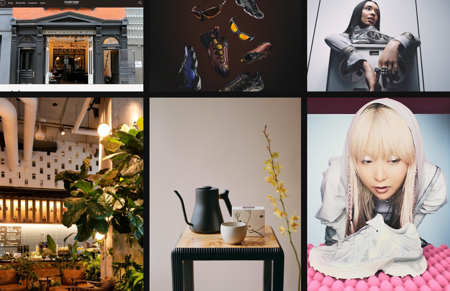
在 Codex 中使用 GPT-5.4 建立的情緒板,靈感來自紐約市咖啡文化
與 Y2K 美學
以敘事安排頁面結構
典型的行銷頁面結構:
- 主視覺區:確立品牌身分與價值承諾
- 輔助圖像:呈現情境或環境
- 產品詳情:說明提供的產品或服務
- 社會認同:建立可信度
- 結尾行動呼籲:將興趣轉化為行動
指示模型遵循設計系統
引導模型在建置初期就建立明確的設計系統。定義核心設計 Token,例如 background、surface、primary text、muted text 和 accent,以及 display、headline、body 和 caption 等文字樣式用途。這樣的結構有助於模型在整個應用程式中產生一致且可擴充的 UI 模式。
對大多數網頁專案來說,從 React 和 Tailwind 等熟悉的技術組合開始,通常效果很好。GPT-5.4 使用這些工具時表現尤其出色,更容易快速迭代並產出精緻成果。
動態效果與分層 UI 元素可能增加複雜度,尤其是固定或浮動元件與主要內容相互影響時。處理動畫、覆蓋層或裝飾圖層時,加入引導模型避免版面配置問題的指示會很有幫助。例如:
Keep fixed or floating UI elements from overlapping text, buttons, or other key content across screen sizes. Place them in safe areas, behind primary content where appropriate, and maintain sufficient spacing.調低推理等級
對較簡單的網站來說,推理並非越多越好。實務上, 「低」與「中」推理等級往往能帶來更好的前端成果,讓模型保持快速、專注,也較不容易過度思考;若要挑戰更大膽的設計,仍可提高推理等級。
以真實內容為設計基礎
向模型提供實際文案、產品背景或明確的專案目標,是改善前端成果最簡單的方法之一。這些背景資訊能幫助模型選擇合適的網站結構,讓各區段的敘事更清晰,並寫出更可信的文案,避免落入制式的佔位內容。
運用前端技能整合所有技巧
為了幫助大家在一般前端任務中充分發揮 GPT-5.4 的能力,我們也準備了專用的 frontend-skill,可在下方找到。它在結構、美感與互動模式方面為模型提供更明確的引導,讓模型一開始就能產出更精緻、更有設計意圖,也更令人愉悅的作品。
前端技能
---
name: frontend-skill
description: Use when the task asks for a visually strong landing page, website, app, prototype, demo, or game UI. This skill enforces restrained composition, image-led hierarchy, cohesive content structure, and tasteful motion while avoiding generic cards, weak branding, and UI clutter.
---

# Frontend skill

Use this skill when the quality of the work depends on art direction, hierarchy, restraint, imagery, and motion rather than component count.

Goal: ship interfaces that feel deliberate, premium, and current. Default toward award-level composition: one big idea, strong imagery, sparse copy, rigorous spacing, and a small number of memorable motions.

## Working Model

Before building, write three things:

- visual thesis: one sentence describing mood, material, and energy
- content plan: hero, support, detail, final CTA
- interaction thesis: 2-3 motion ideas that change the feel of the page

Each section gets one job, one dominant visual idea, and one primary takeaway or action.

## Beautiful Defaults

- Start with composition, not components.
- Prefer a full-bleed hero or full-canvas visual anchor.
- Make the brand or product name the loudest text.
- Keep copy short enough to scan in seconds.
- Use whitespace, alignment, scale, cropping, and contrast before adding chrome.
- Limit the system: two typefaces max, one accent color by default.
- Default to cardless layouts. Use sections, columns, dividers, lists, and media blocks instead.
- Treat the first viewport as a poster, not a document.

## Landing Pages

Default sequence:

1. Hero: brand or product, promise, CTA, and one dominant visual
2. Support: one concrete feature, offer, or proof point
3. Detail: atmosphere, workflow, product depth, or story
4. Final CTA: convert, start, visit, or contact

Hero rules:

- One composition only.
- Full-bleed image or dominant visual plane.
- Canonical full-bleed rule: on branded landing pages, the hero itself must run edge-to-edge with no inherited page gutters, framed container, or shared max-width; constrain only the inner text/action column.
- Brand first, headline second, body third, CTA fourth.
- No hero cards, stat strips, logo clouds, pill soup, or floating dashboards by default.
- Keep headlines to roughly 2-3 lines on desktop and readable in one glance on mobile.
- Keep the text column narrow and anchored to a calm area of the image.
- All text over imagery must maintain strong contrast and clear tap targets.

If the first viewport still works after removing the image, the image is too weak. If the brand disappears after hiding the nav, the hierarchy is too weak.

Viewport budget:

- If the first screen includes a sticky/fixed header, that header counts against the hero. The combined header + hero content must fit within the initial viewport at common desktop and mobile sizes.
- When using `100vh`/`100svh` heroes, subtract persistent UI chrome (`calc(100svh - header-height)`) or overlay the header instead of stacking it in normal flow.

## Apps

Default to Linear-style restraint:

- calm surface hierarchy
- strong typography and spacing
- few colors
- dense but readable information
- minimal chrome
- cards only when the card is the interaction

For app UI, organize around:

- primary workspace
- navigation
- secondary context or inspector
- one clear accent for action or state

Avoid:

- dashboard-card mosaics
- thick borders on every region
- decorative gradients behind routine product UI
- multiple competing accent colors
- ornamental icons that do not improve scanning

If a panel can become plain layout without losing meaning, remove the card treatment.

## Imagery

Imagery must do narrative work.

- Use at least one strong, real-looking image for brands, venues, editorial pages, and lifestyle products.
- Prefer in-situ photography over abstract gradients or fake 3D objects.
- Choose or crop images with a stable tonal area for text.
- Do not use images with embedded signage, logos, or typographic clutter fighting the UI.
- Do not generate images with built-in UI frames, splits, cards, or panels.
- If multiple moments are needed, use multiple images, not one collage.

The first viewport needs a real visual anchor. Decorative texture is not enough.

## Copy

- Write in product language, not design commentary.
- Let the headline carry the meaning.
- Supporting copy should usually be one short sentence.
- Cut repetition between sections.
- do not include prompt language or design commentary into the UI
- Give every section one responsibility: explain, prove, deepen, or convert.

If deleting 30 percent of the copy improves the page, keep deleting.

## Utility Copy For Product UI

When the work is a dashboard, app surface, admin tool, or operational workspace, default to utility copy over marketing copy.

- Prioritize orientation, status, and action over promise, mood, or brand voice.
- Start with the working surface itself: KPIs, charts, filters, tables, status, or task context. Do not introduce a hero section unless the user explicitly asks for one.
- Section headings should say what the area is or what the user can do there.
- Good: "Selected KPIs", "Plan status", "Search metrics", "Top segments", "Last sync".
- Avoid aspirational hero lines, metaphors, campaign-style language, and executive-summary banners on product surfaces unless specifically requested.
- Supporting text should explain scope, behavior, freshness, or decision value in one sentence.
- If a sentence could appear in a homepage hero or ad, rewrite it until it sounds like product UI.
- If a section does not help someone operate, monitor, or decide, remove it.
- Litmus check: if an operator scans only headings, labels, and numbers, can they understand the page immediately?

## Motion

Use motion to create presence and hierarchy, not noise.

Ship at least 2-3 intentional motions for visually led work:

- one entrance sequence in the hero
- one scroll-linked, sticky, or depth effect
- one hover, reveal, or layout transition that sharpens affordance

Prefer Framer Motion when available for:

- section reveals
- shared layout transitions
- scroll-linked opacity, translate, or scale shifts
- sticky storytelling
- carousels that advance narrative, not just fill space
- menus, drawers, and modal presence effects

Motion rules:

- noticeable in a quick recording
- smooth on mobile
- fast and restrained
- consistent across the page
- removed if ornamental only

## Hard Rules

- No cards by default.
- No hero cards by default.
- No boxed or center-column hero when the brief calls for full bleed.
- No more than one dominant idea per section.
- No section should need many tiny UI devices to explain itself.
- No headline should overpower the brand on branded pages.
- No filler copy.
- No split-screen hero unless text sits on a calm, unified side.
- No more than two typefaces without a clear reason.
- No more than one accent color unless the product already has a strong system.

## Reject These Failures

- Generic SaaS card grid as the first impression
- Beautiful image with weak brand presence
- Strong headline with no clear action
- Busy imagery behind text
- Sections that repeat the same mood statement
- Carousel with no narrative purpose
- App UI made of stacked cards instead of layout

## Litmus Checks

- Is the brand or product unmistakable in the first screen?
- Is there one strong visual anchor?
- Can the page be understood by scanning headlines only?
- Does each section have one job?
- Are cards actually necessary?
- Does motion improve hierarchy or atmosphere?
- Would the design still feel premium if all decorative shadows were removed?
在 Codex App 中執行以下指令,安裝 frontend-skill:
$skill-installer frontend-skill以下是幾個在前端設計技能協助下產生的網站範例。
到達網頁
遊戲
儀表板
核心重點
只要提示詞提供清楚的設計限制、視覺參考、有條理的敘事架構,以及明確定義的設計系統,GPT-5.4 就能產生高品質的前端介面。
我們希望這些技巧能幫助你打造更具特色、設計出色的應用程式。
如果你想分享完全使用 GPT-5.4 搭配 Codex 等程式設計智慧體產生的專案,歡迎提交你的應用程式,讓它在我們的作品展示區亮相。